PT
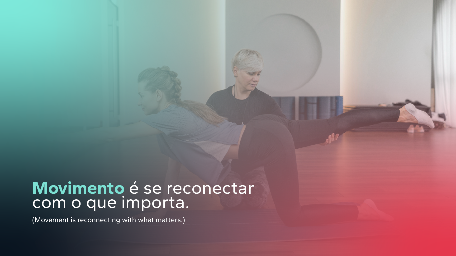
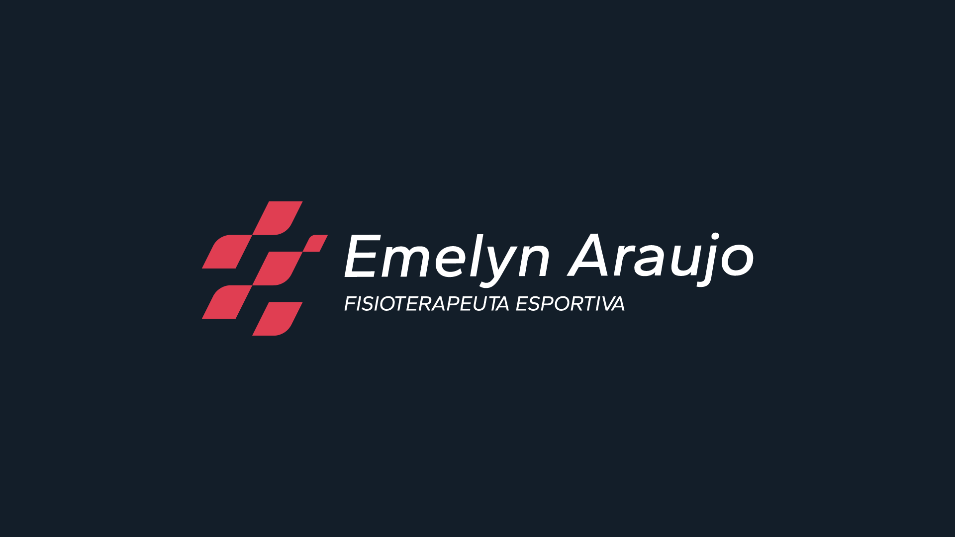
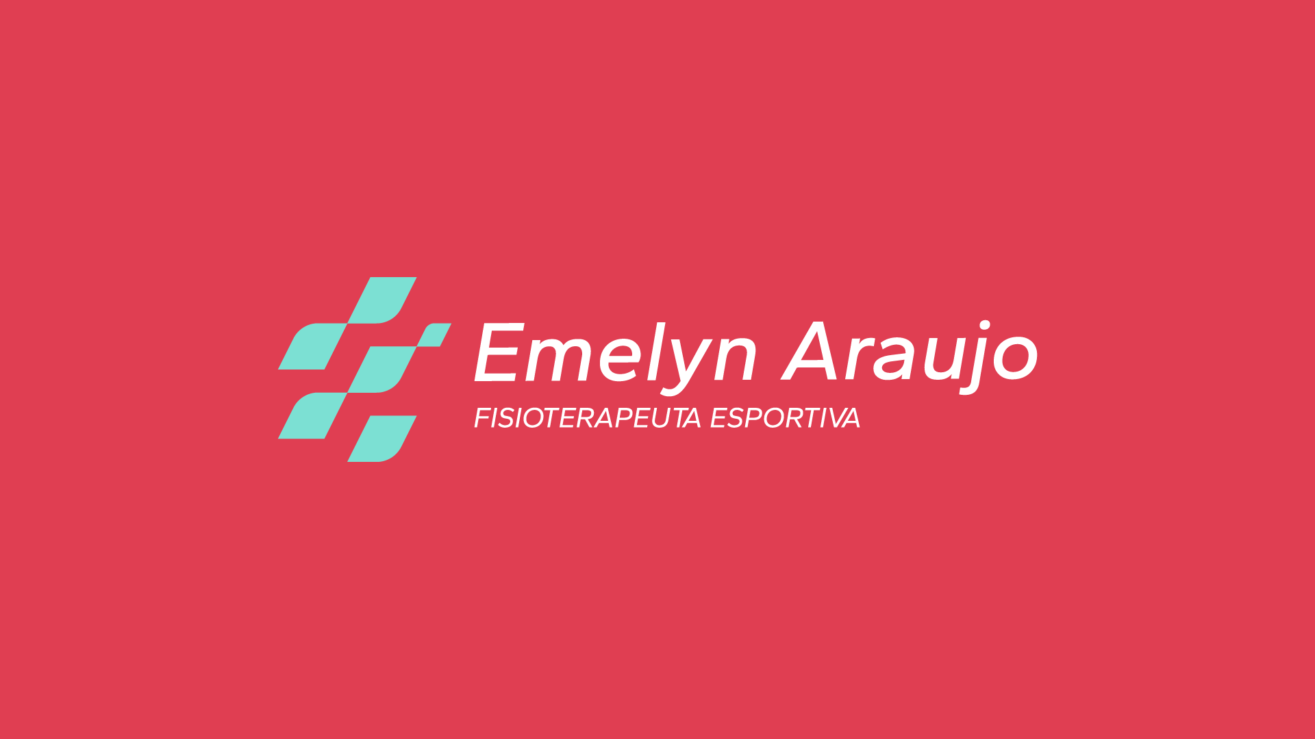
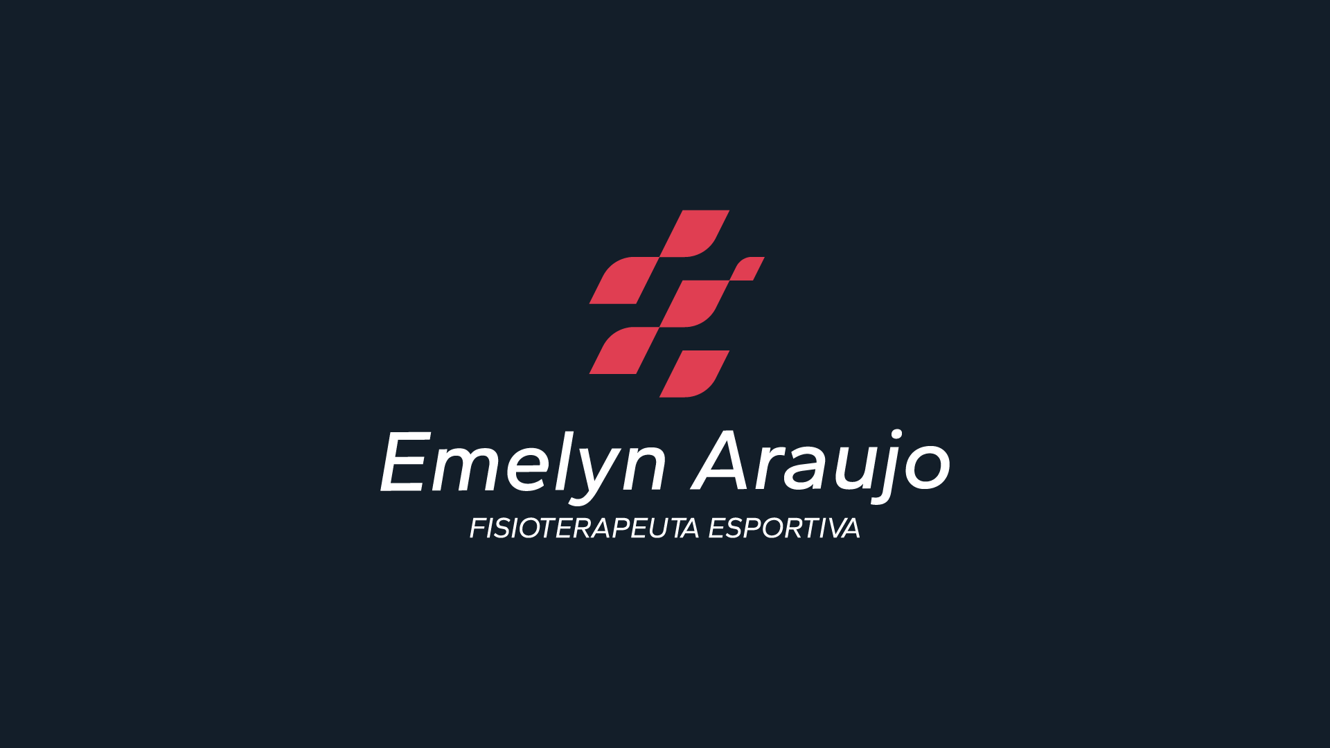
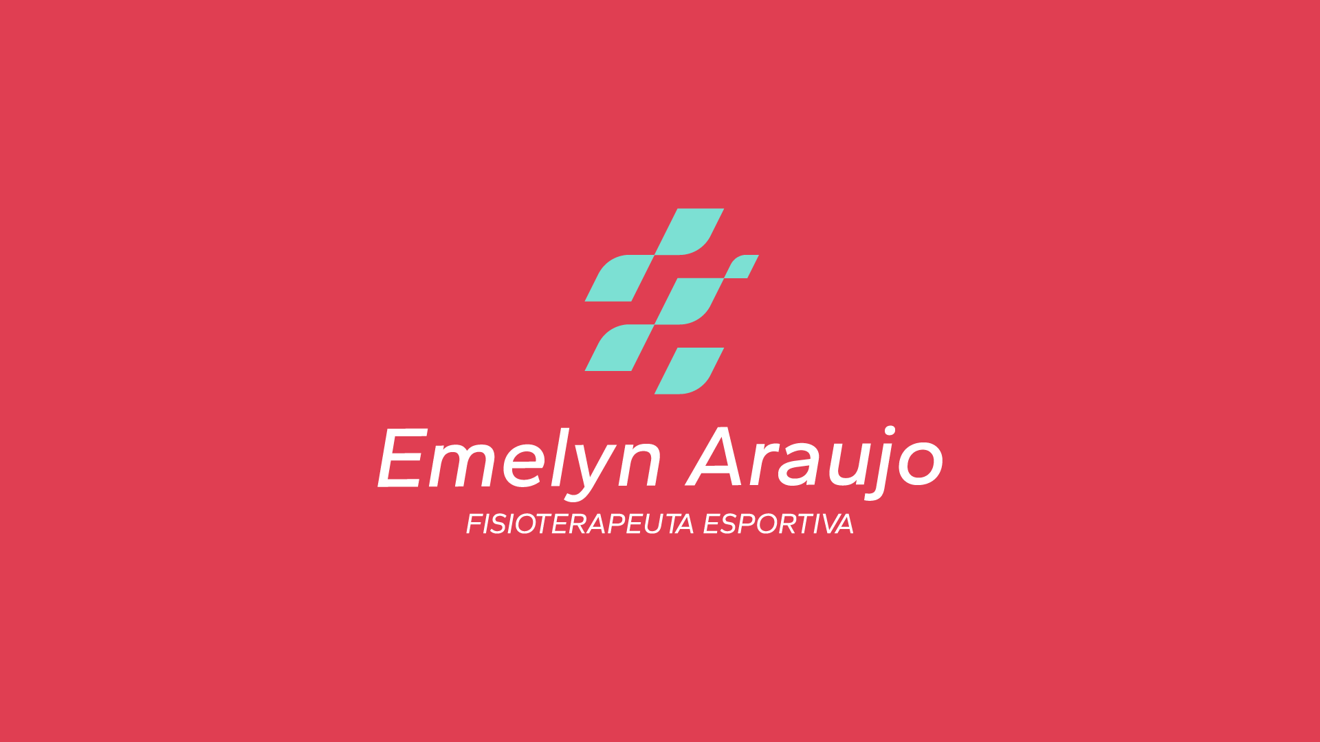
A identidade visual da Emelyn nasce do encontro entre técnica, sensibilidade e propósito. Mais do que uma fisioterapeuta, ela é agente de transformação na vida de quem passa por suas mãos. Por isso, o conceito que guia esta identidade é “Movimento com Propósito”. A marca representa progresso consciente, acolhimento e força. A proposta visual busca fugir dos elementos genéricos da fisioterapia, apostando em soluções sofisticadas, leves e autênticas.
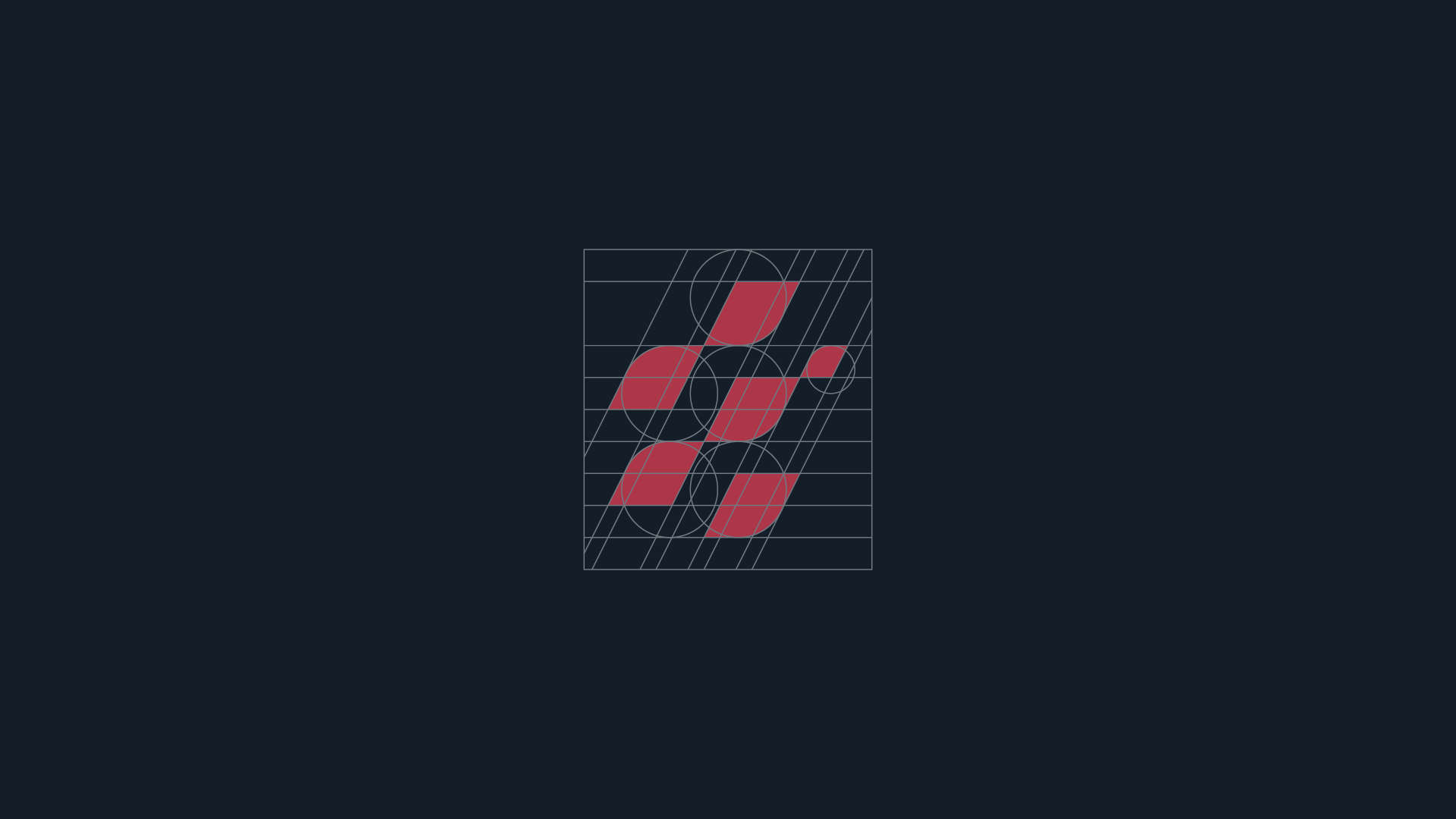
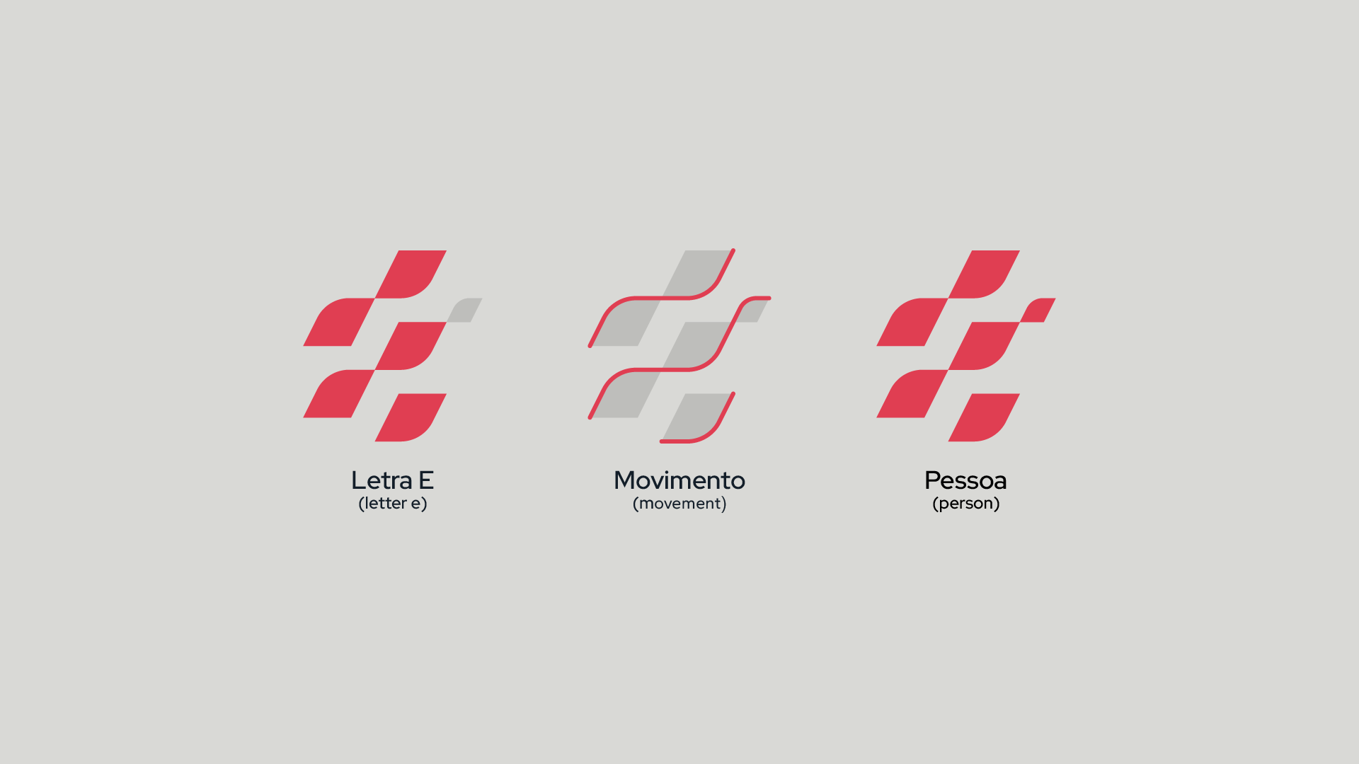
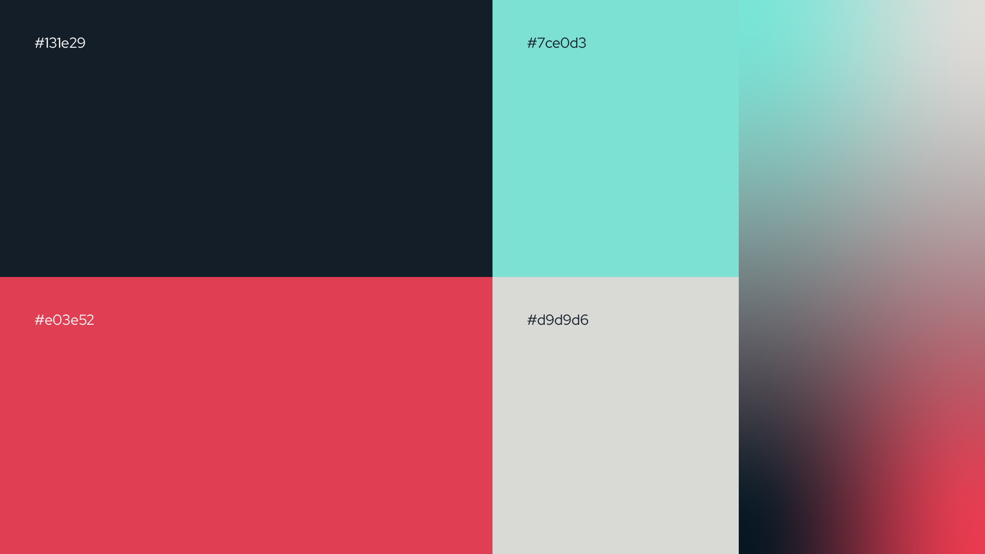
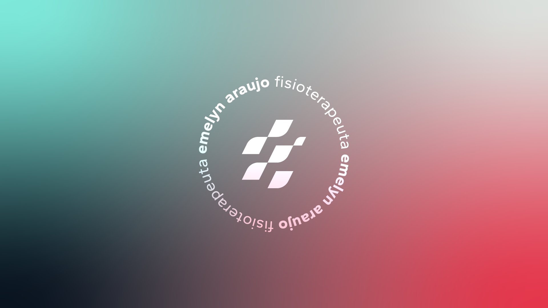
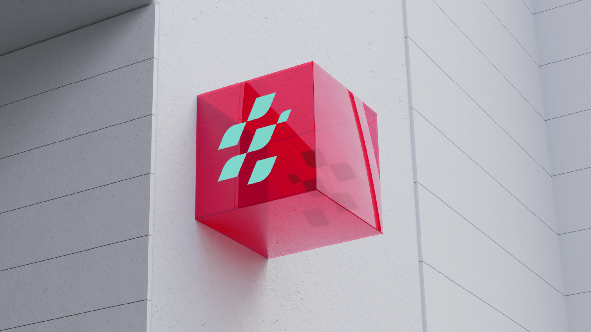
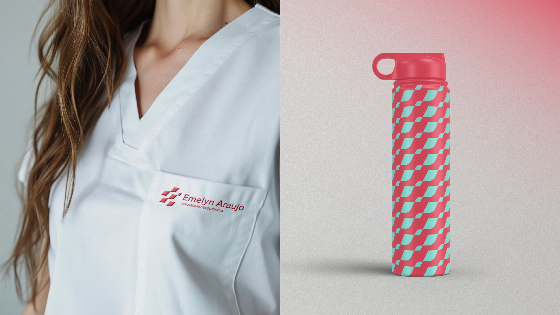
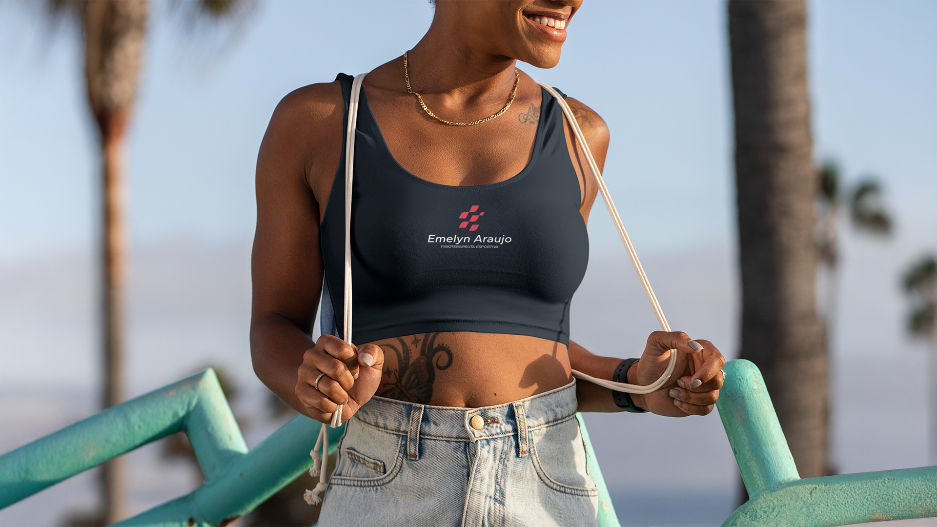
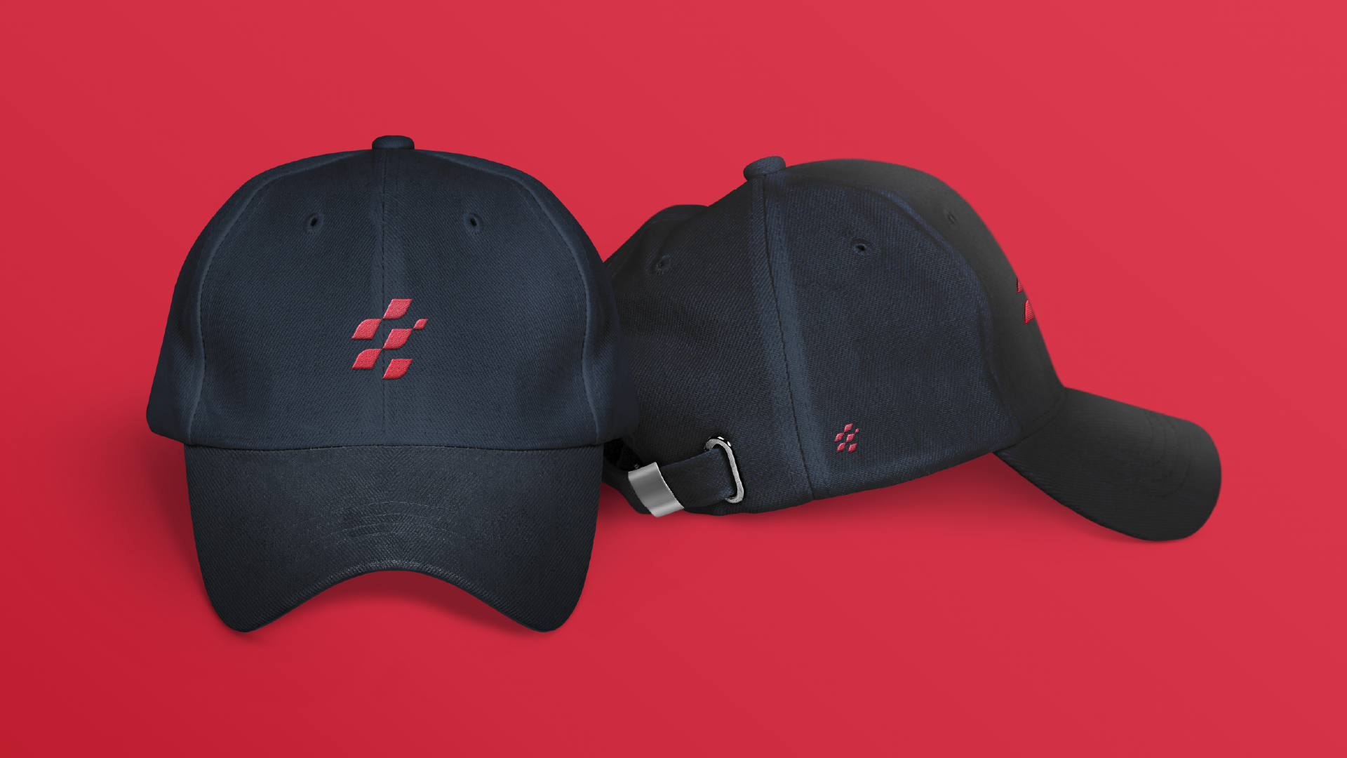
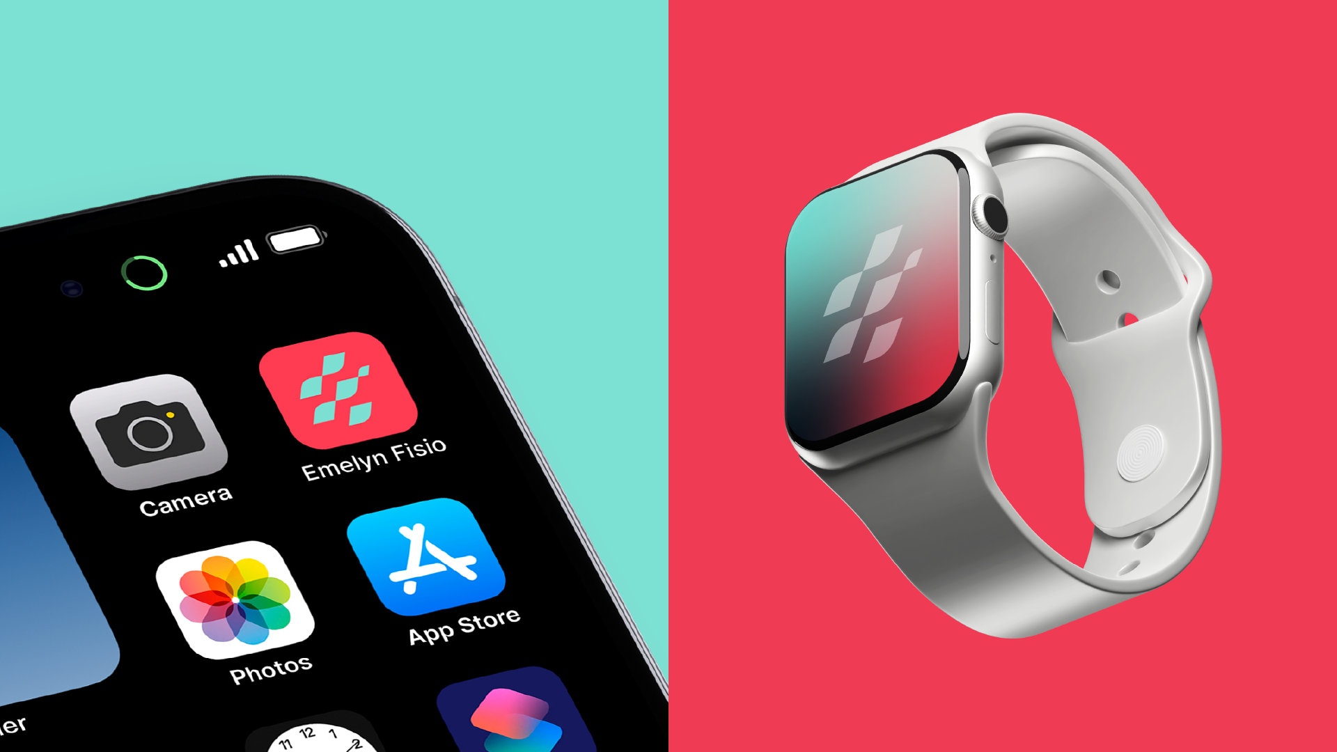
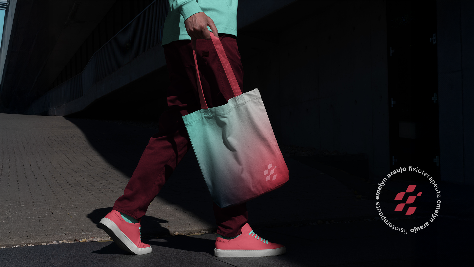
A tipografia trará clareza e humanização. Enquanto o símbolo inspirado em movimento e fluidez, refletirá o dinamismo e a evolução presentes no trabalho da Emelyn. A paleta de cores foi construída para unir vigor e serenidade, representando tanto os atletas que ela atende quanto sua forma cuidadosa de atuar. O resultado será uma marca com presença, que conecta, acolhe e inspira confiança desde o primeiro olhar.
EN
Emelyn’s visual identity is born from the intersection of technique, sensitivity, and purpose. More than a physiotherapist, she is an agent of transformation in the lives of those who come under her care. For this reason, the concept guiding this identity is “Movement with Purpose.” The brand represents conscious progress, warmth, and strength. The visual proposal aims to move away from generic physiotherapy elements, opting instead for sophisticated, light, and authentic solutions.
The typography will convey clarity and a human touch, while the symbol—drawn from movement and fluidity—will reflect the dynamism and evolution inherent in Emelyn’s work. The color palette was designed to balance vigor and serenity, representing both the athletes she serves and her careful, attentive approach. The result will be a brand with presence that connects, nurtures, and inspires trust from the very first glance.